Results 41 to 78 of 78
Thread: The "Signature" Thread
- 18 Feb. 2011 11:47pm #41Most Posts 2012


- Age
- 97
- Join Date
- Nov. 2009
- Location
- In the computer
- Posts
- 11,186
- Reputation
- 1029
- LCash
- 11.36
- Awards


- 19 Feb. 2011 01:01am #42

I was trying to get the city behind him only
along with that broken glass effect
But i guess i failed this one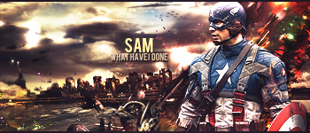
I Don't Bite!
- 19 Feb. 2011 07:28pm #43

@ Bump


Which?
I Don't Bite!
- 28 Feb. 2011 12:44am #44

Sorry I've been out for the count again :x
Just trying to make the most of my junior year and get into college etc.
Sam I've never seen you around before, or have I? D:
As for your two signatures, I like the 2nd one the most~ The first one just seems a bit over saturated with color. The text of the second one should be moved around a bit so the "w" in what is more visible. Otherwise, amazing!

posting nonsensical crap everyday.
- 06 Mar. 2011 03:09am #45

like the 1st one sam.
- 15 Mar. 2011 12:06am #46

It's been a while, cc on my new signature?

I need help with text :/
- 15 Mar. 2011 10:25pm #47
- 15 Mar. 2011 10:54pm #48

I don't like the font overlayed like that, its hard to make out
- 16 Mar. 2011 01:45am #49
- 16 Mar. 2011 01:46am #50Most Posts 2012


- Age
- 97
- Join Date
- Nov. 2009
- Location
- In the computer
- Posts
- 11,186
- Reputation
- 1029
- LCash
- 10.09
- Awards


- 16 Mar. 2011 02:28am #51

I didn't see the words at the bottom, um. Try finding a good shade of color that matches the signature but doesn't blend where your going to place your text, then either use the eraser tool and choose some good splatter brushes and make light clicks so it doesn't stick out as much. Make sure not to go overboard and erase the whole text. Or you can try using the smudge brush and smuding outwards with the flow. Make sure you have a good smudge brush though or it will end up looking like garbage. Make sure to sharpen it too.
- 16 Mar. 2011 11:33pm #52Minecraft Donator

Artificial's Breast Implants

- Join Date
- Jun. 2010
- Location
- My HQ
- Posts
- 3,004
- Reputation
- 229
- LCash
- 10.70
- 17 Mar. 2011 08:45am #53
- 17 Mar. 2011 12:08pm #54

How do I signatures?

- 31 Mar. 2011 06:05am #55
 Don't know if you still need criticism, but text isn't the only thing you need help with. The text might actually look nice if it weren't for the placement of it.
Also, I don't care what you're making, always remember the Rule of Three. If you shove the character in the corner, it's going to look like crap.Depends on if you made that or not.
Miserable Sorrow
- 31 Mar. 2011 06:48am #56
- 26 Apr. 2011 02:35pm #57

This isn't a signature per say. I was thinking about resizing it into one though. But I may just do another one entirely.

Here is the second one I made. Took about 15 minutes. Although this one has less going on than the first one. Might not seem like it though.
It's much smaller also. Maybe typical signature size.

Last edited by Onikokiro; 26 Apr. 2011 at 03:24pm.
- 26 Apr. 2011 10:45pm #58
- 27 Apr. 2011 04:40am #59

I only did that as a sample. It was not a complete work. And I just got the new (At least I think it's new. ) Photoshop CS5 so I haven't had much a chance to actually download any new brushes. And The colors actually DO go well, imo. I guess it's just all about taste. Maybe if you didn't give negative critique and tried to give someone a pointer or two I could fix the problem to your liking. :thumbsup:
I made another possible sig for myself. This one took at least 45 minutes. Here it is.

Last edited by Onikokiro; 27 Apr. 2011 at 10:37am.
- 28 Apr. 2011 01:01am #60Minecraft Donator

Artificial's Breast Implants

- Join Date
- Jun. 2010
- Location
- My HQ
- Posts
- 3,004
- Reputation
- 229
- LCash
- 2.55
- 28 Apr. 2011 02:59am #61


I Think its one of the best I've made.
- 28 Apr. 2011 04:21am #62
- 28 Apr. 2011 06:05am #63

I'm not gonna lie to you, It sucks. I didn't tell you how to fix it because I don't think it's fixable. I can only tell you what not to do for future cases.
The new one: The arrow heads look sloppy, straighten the edges out. Get a focal point, possibly some sort of render. There's also too much going on. Way too much.
---------- Post added at 06:05 AM ---------- Previous post was at 06:04 AM ----------
This is old news.
- 28 Apr. 2011 09:26am #64

I like my signature to have alot going on. So that was the main point in this. I actually did not do the arrow heads. It was a brush preset I downloaded.
Focal point....... Focal point for what exactly? It's just a name and a design. Nothing very spectacular. And what type of render would you recommend for a signature like that........?
And I don't think it sucks. If I did I wouldn't post it here. Where hundreds of people can view them. It's all about matter of opinion and MY opinion says it's pretty damn awesome. So I can take some advice from you. Maybe a pointer or two, but in the end...... I don't really care about what someone else thinks about it.
---------- Post added at 07 1 AM ---------- Previous post was at 06:15 AM ----------
Here is a new signature I made. It has a render in it. I chose to add some spotlights. I thought it would make it seem like it was on display, or on a wall or something.
I made a second version of it as well. The second one I like most though.

Second one .....

---------- Post added at 09:26 AM ---------- Previous post was at 07 1 AM ----------
Here is another couple of signatures I made. Maybe like 5 minutes a piece.


Last edited by Onikokiro; 28 Apr. 2011 at 06:18am.
- 28 Apr. 2011 08:51pm #65

They make look good to you, and you're allowed that opinion, and i'm allowed to think it doesn't look good. I'm also allowed to point out that from a technical standpoint, they aren't very good.
---------- Post added at 08:51 PM ---------- Previous post was at 08:50 PM ----------
also, stop doing this: vectors - Google Search
- 28 Apr. 2011 11:01pm #66

I don't search Google for vectors. What made you think that?
I downloaded a couple of brushes yes but I didn't search Google for any vectors or nothing like that. Where I get my brushes from is totally legit and with full permission. I don't have to steal anything or rip them from Google images. Now stop bringing up a bunch of undercuts. (First a shot at me because I don't use renders, then a shot at me implying that I vector hunt on Google Images....) Honestly I can't seem to remember you giving one good reason to say that my signatures "...Suck" Maybe that is the case, but whatever. I don't care. .Last edited by Onikokiro; 28 Apr. 2011 at 11:04pm.

- 29 Apr. 2011 05:23am #67

That being said, the technical things wrong with your signatures, and hence things you need t Originally Posted by Thomas
  rk on and improve:
No focal
No flow
No Color Scheme
No Balance
Text/Typography (this is something i need work with myself)
Learning more Advanced skills of Photoshop
Stop using brushes so much
THAT being said, I had forgotten I made this. I did make this right? I don't really remember making this.

- 29 Apr. 2011 06:01am #68Moderator Topic-Clearing

- Age
- 28
- Join Date
- Nov. 2009
- Location
- Asia
- Posts
- 2,701
- Reputation
- 72
- LCash
- 1.60
- Awards

- 29 Apr. 2011 09:58am #69

I decided to cut the crap and actually see what it is you can actually help me with to better my signatures.
Swallowing my pride I suppose...... Yeah, I guess that's what it is.
No focal - Do I need one honestly? How would I do this if I did?
No flow - This I believe I can work on asap.
No Color Scheme - How don't I have a color scheme? Or how would you suggest going about this step.
No Balance - Don't know what to do about this one.......
Text/Typography (this is something i need work with myself) - What would I put in it to begin with? I usually just use my username. That's kinda all I want in there. Is that a bad thing?
Or do you mean like I need t rk on the way I put it in or something.
Learning more Advanced skills of Photoshop - Lol, I COULD find a tutorial. But most of them don't tell you how to make your own. Generaly they just show you how they made theirs and how to make some lame ass CoD signature.
Stop using brushes so much - I like the brushes I downloaded. Unless you can provide some sort of alternative.
- 29 Apr. 2011 07:35pm #70

Well, since you asked nicely...
No focal- Yes, you NEED a focal. One of the first things you learn in Design and draw is that you NEED a focal. The focal is the thing you work on first, while everything else is put in to enhance and draw the eye to the focal. You could achieve this by darkening the things around the focal, but that is a cheap way to achieve it. Truly, you need to get your focal down first, no matter what.
No flow- good.
No Color Scheme- read up on this page. Particularly pay attention to the Color Harmonies section.
No Balance- Rule of thirds - Wikipedia, the free encyclopedia
Text/Typography (this is something i need work with myself)- You need t rk on where you place the text, the design of the text, and getting the text t
 rk with the rest of the picture.
Learning more Advanced skills of Photoshop- Yes, I know that most tutorials only tell you how to make one certain thing, but the idea is to do that tutorial, see how they got that desired effect and then use that newfound knowledge in some different way to make your art better.
Stop using brushes so much- Brushes are cool, but don't comprise your entire signature of them.
- 30 Apr. 2011 06:10am #71Moderator Topic-Clearing

- Age
- 28
- Join Date
- Nov. 2009
- Location
- Asia
- Posts
- 2,701
- Reputation
- 72
- LCash
- 0.44
- Awards

- 30 Apr. 2011 06:17am #72

Your signatures Oni,hurt my eyes. There's so much going on. Like minora said with the focal crap and text placement. Without focal flow text and blending. Your signature is fucked. Sorry to say. Any type of brush is a horrible idea for making signatures. Unless your doing contrast or clipping masks. Other than that don't use em. All of yours I see is a bunch of random brushing that makes no sense. Read a few tutorials, take the knowledge gained, and start creating your own. Overall every signature I've seen from you is a 1/10. Not being rude.
- 30 Apr. 2011 09:53am #73

@GotxBrain: Thanks for the links, I'll be sure to read them.
@Supra: Gotcha.
- 30 Apr. 2011 01:18pm #74

I made this little picture or whatever trying out a couple of the render effects and stuff. I kinda made it looc like it was being recorded. Also tried to see if I could get a focal point in it. I tried to make it so you look at the city rather than the girl.
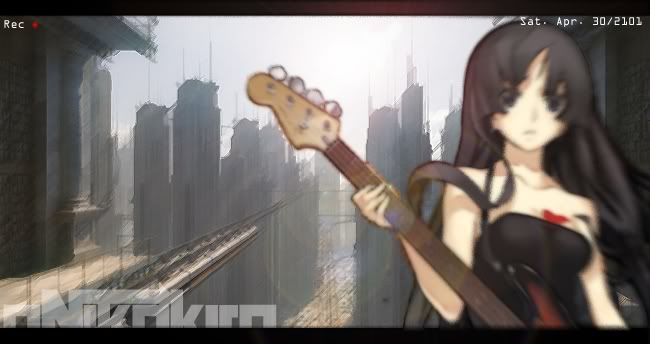
Lemme know if I did anything right or wrong in this pic.
- 30 Apr. 2011 05:52pm #75

its a floating guitarist In a futuristic looking city. I love the background.
- 01 May. 2011 10:50pm #76


Rate it.
- 03 May. 2011 05:16am #77
- 03 May. 2011 03:38pm #78

Never in the background. Gotcha.


 LinkBack URL
 About LinkBacks



 Reply With Quote

