Since so many of these are popping up, let's just put it all in one ok guys? I'm going to add some rules so this doesn't fall apart we we all go hatin' on eachother. This is a place to showcase, discuss, and constructively criticize. This doesn't have to be simply signatures but anything else art or creation related. If you would like to kill someone's pride or harass them, please take it to a private level to keep this thread clean.
Rules
- You may post each new creation in a separate post as long as you do not double post.
- If you've edited the image please only update your post and reference it from there.
- Follow LG guidelines for images; no gore or nudity.
- No pessimistic attitudes, take pride in your work. i.e. "Yeah I know it sucks, but I'm posting it anyway so you guys will say something nice to me."
Have fun, I'll start
Tiny siggy:
Results 1 to 40 of 78
Thread: The "Signature" Thread
- 31 Jan. 2011 02:28am #1
 The "Signature" Thread
 Last edited by Saved; 06 Feb. 2011 at 11:32pm.

posting nonsensical crap everyday.
- 31 Jan. 2011 02:38pm #2

Some parts look a bit oversharpened(unless it was some effect you were going for. But if you didn't sharpen it, i'm referring to those little light blue things behind her). It's really simple and likable, but doesn't really appeal to me on a white background like the LG skin since you're using a light colored background too(would be good on a darker skin tho). Oh, and I dislike the rounded edges(I don't like them in any tag, honestly. Prolly because it's my personal preference, or that people only use them in sprite tags recently). I like the colors.
Try adding more effects in your next tag, and make it bigger(but not too big).
Hm, that's all xD. My thoughts are all over the place, sorry >.<It's ZenGen yoo.
- 31 Jan. 2011 04:33pm #3

Yes, I just decided to sharpen the whole thing instead of some parts. I like really sharp things for some reason >.> I really need to stop doing that. I decided to use the rounded edges because the pattern I used in the background was rounded loops of lace. But to clear things up that grainy effect is intentional, I don't know what I was trying to achieve with that...I just thought the lace looked too strong and I didn't want to reduce the layer opacity so I did that. I didn't want too much effect for that fresh look. And the smallness is also intentional, siggy these days are as obese as the average middle aged american. Also you're right the siggy would fit better on a darker background!
Post something up too!
something not signature related:Last edited by Saved; 06 Feb. 2011 at 11:32pm.

posting nonsensical crap everyday.
- 01 Feb. 2011 12:46am #4Minecraft Donator

Artificial's Breast Implants

- Join Date
- Jun. 2010
- Location
- My HQ
- Posts
- 3,004
- Reputation
- 229
- LCash
- 10.64
- 01 Feb. 2011 12:52am #5
- 01 Feb. 2011 05:54am #6

I already have your opinion on it, saved, but I'd like everyone else's as well

Thanks again saved!
- 01 Feb. 2011 02:14pm #7
- 01 Feb. 2011 03:13pm #8

^The double focal makes my eyes go in all directions. The text is nice, but the whole thing feels like it lacks something. I can't put my finger on it tho
It's ZenGen yoo.
- 01 Feb. 2011 05:11pm #9Minecraft Donator

Artificial's Breast Implants

- Join Date
- Jun. 2010
- Location
- My HQ
- Posts
- 3,004
- Reputation
- 229
- LCash
- 10.00
- 01 Feb. 2011 06:43pm #10
- 01 Feb. 2011 10:45pm #11
- 02 Feb. 2011 12:02am #12

Just fucking around for a bit and this came out of my efforts.

I luv my fishy ;3
- 02 Feb. 2011 09:05am #13

Tags with double focals generally suck, as you would know if you've been critiqued in any real gfx site(and not a hacking site). Yes, they are allowed, but they suck, and I've yet to see a tag with a good double focal.
If by pictures you mean photos, sure. But sigs/tags? I don't think so.
@Eli
That's pretty cool.Last edited by Xaoi; 02 Feb. 2011 at 09:11am.
It's ZenGen yoo.
- 02 Feb. 2011 03:16pm #14

@Martin
Awesome background, it looks like the sky. The color is also great because it kind of gives that look sepia feel to it. What I like most would probably be the speckles of light which imo looks like dirt(in a goodway), which looks like link is galloping in somewhere. However you could do a lot more with the text, such as putting so it runs down his arm, or using a combination of different fonts. Also the brushes on the right really bother me. I can see a circle brush with its opacity lowered...I suggest you blur it out.
@gotxbrain
I guess you have to know a bit about the whole signature. The double focals on opposite sides bothered me until he lowered the opacity of the guy. I believe the man is the "silent" part, he's needed in the sig but he's not the attention. He'll be what your eyes shift to after seeing the crowbar. I believe the crowbar represents some sort of action that makes him the "protagonist."
@eli
FISHIEEEE o 3o
@ Xoom
; A ; I've never been on a real gfx site before. Maybe I should try now that I'm on the gfx team.

posting nonsensical crap everyday.
- 02 Feb. 2011 03:56pm #15

Oh, and I didn't mean to offend anyone. But I'm just pleading, if you post, can you please be at least receptive to the comments.
Anyways, sorry. I'll just post critique from now on.Last edited by Xaoi; 02 Feb. 2011 at 07:33pm.
It's ZenGen yoo.
- 02 Feb. 2011 09:16pm #16Minecraft Donator

Artificial's Breast Implants

- Join Date
- Jun. 2010
- Location
- My HQ
- Posts
- 3,004
- Reputation
- 229
- LCash
- 10.00

On the right, it's actually part of the C4D i set to some setting, which I forgot, to make it get that sepia effect. And everytime I try erasing that, it erases the whole canvas I don' t know why. But yea, I've tried.
And I was looking for some new fonts, but I can't seem to find those "pro" fonts I want.

I was looking for that font, but couldn't for the life of me find it..
- 03 Feb. 2011 02:28am #17


 Idk Very Simple xD
I Should Make A Tut On It
~ Holy Shiz Its Huge~ xDLast edited by Sam; 03 Feb. 2011 at 02:40am.
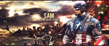
I Don't Bite!
- 03 Feb. 2011 02:37am #18Most Posts 2012


- Age
- 97
- Join Date
- Nov. 2009
- Location
- In the computer
- Posts
- 11,186
- Reputation
- 1029
- LCash
- 12.07
- Awards


If i find a tut in lg i'll try it lol because i suck and i wanna see if i can follow it correctly.
If not then i'll try one on youtube cause i have nothing better to do.


- 04 Feb. 2011 09:44pm #19


I just liked this, so I ended up scanning this picture and fucking with it for a bit.
- 05 Feb. 2011 02:07am #20

I think the left side is too much but overall its epic!

I Don't Bite!
- 07 Feb. 2011 01:43am #21

@Bump
Getting This Thread A Bit More Active


I Don't Bite!
- 07 Feb. 2011 01:46am #22Most Posts 2012


- Age
- 97
- Join Date
- Nov. 2009
- Location
- In the computer
- Posts
- 11,186
- Reputation
- 1029
- LCash
- 12.10
- Awards


- 07 Feb. 2011 09:20am #23


WHUT YEW MEAN?
so yeah, took a bit of advice and added a few more colors than i'm used t rking with.
edit: why does the front of that car remind me of this?
urk, a better version

Last edited by gotxbrain; 07 Feb. 2011 at 11:59pm.
- 08 Feb. 2011 05:59am #24


I had a bunch of splatter brushes of my choices
bevel and emboss/ some gradients and ligthing effects
overall i think i did good on this one
but i think i should add a background dont you think?
I Don't Bite!
- 08 Feb. 2011 06:03am #25

Not a big fan of the colors at all. Some of the splatter brushes seem too low qual/jagged. On top of that it looks too hectic and random. I do like the render, and the background looks pretty awesome. That line next to his eye looks out of place. There is NO flow at all. 4/10
- 08 Feb. 2011 06:29am #26

I agree with gotxbrain. Not much flow. And images usually tend to look alot better if you sharpen them. And the splatter brushes are really low quality, in my opinion, some of the best sigs come from using a good smudge brush a nice splatter brush for clipping masks to add flow. A good render that will help with flow. And a light source. I can't tell if its from the bottom left or the right. It should be in the top left if you look at the bears shadows. I tend to use very little c4d's as possible. They start to clutter up and take a lot of focus off your subject. You want to draw your eye to one thing on the image, make it less distracting. The font placement is akward, use the rule of thirds to really enhance the image, font can Make or break an image, as I've learned the best font is the most simple, such as ms sans ir Arial. As the main focus is your render, your font should be noticeable but not take or over power the whole picture. The Japanese stuff makes it look tacky and the gradient on the font does too. Try to use one color from your picture to help it blend to help your main subject. And the border is really large, usually a 2px is the best, or the cinematic border. That's just my opinion. Not saying I don't like it. If you want the best critique on it, start posting your stuff on the planet renders forum. The artists on there are some of the best I've ever seen. And they are brutally honest. They will kill your self esteem but it helps alot. If that makes sense.
- 08 Feb. 2011 06:40am #27

great input, care to take a crack at critiquing mine now?
- 08 Feb. 2011 06:42am #28

Do you really want me to?
- 08 Feb. 2011 06:55am #29
- 08 Feb. 2011 07:10am #30

It's a very ammature signature. First thing I see is the car. It has a very distracting green glow to the headlight. The render is of low quality, and it us very distorted, there isint much blending if not any, you have blue and yellow random c4d's that add absolutely no flow. There is no light source, the image is not very "crisp/clean" looking. As I look at the background there is no blending with the car, it looks as if the car was a giant sticker slapped onto a background. The c4d's with the bg does not help as it goes straight to a distracting color Change. And the brushing on the left has no effect whatsoever. The text is very large and tacky, its not well placed and does not blend at all. If you look at the signature altogether your eyes are moving around alot and can't tell what to focus on.
I would give it a 1/10
That's my honest opinion. Not trying to hurt your feelings at all. I love seeing peoples work. I normally don't criticize. Hope I helped.m
- 08 Feb. 2011 07:44am #31

After fixing the things you told me to fix to the best of my ability, i got this. IMO, it looks like shit. A lot worse than what I started with :/

also, I have no clue what you're talking about when you mention my render. The quality is fine, methinks. It was originally 700 by 1000, resized considerably. I actually didn't distort it at all.
- 08 Feb. 2011 02:38pm #32
- 08 Feb. 2011 10:37pm #33

It's odd.
The flow goes in two directions, and the render, in my opinion isn't stylized enough, meaning you could have done more.
You focused mainly on the background, and the render didn't get enough attention.
There's also a weird ass C4D randomly coming out of his back.
By the way, gradient maps are your best friend, just use dark and light colors that are complementary.
- 09 Feb. 2011 12:01am #34

I've had weird sigs lately
i am no inspiration atm
But yeh i did some gradients and textures on the render to make it look like that
the original render is black and white
I Don't Bite!
- 09 Feb. 2011 04:15am #35
- 09 Feb. 2011 05:31pm #36Minecraft Donator

Artificial's Breast Implants

- Join Date
- Jun. 2010
- Location
- My HQ
- Posts
- 3,004
- Reputation
- 229
- LCash
- 12.00
- 18 Feb. 2011 03:25am #37


 Critique
I Don't Bite!
- 18 Feb. 2011 03:49am #38Minecraft Donator

Artificial's Breast Implants

- Join Date
- Jun. 2010
- Location
- My HQ
- Posts
- 3,004
- Reputation
- 229
- LCash
- 11.95
- 18 Feb. 2011 04:04am #39

Just thought id try something new

---------- Post added at 03:55 AM ---------- Previous post was at 03:54 AM ----------
ill fix it just for you
---------- Post added at 04:04 AM ---------- Previous post was at 03:55 AM ----------

Edited version
I Don't Bite!
- 18 Feb. 2011 11:25pm #40Minecraft Donator

Artificial's Breast Implants

- Join Date
- Jun. 2010
- Location
- My HQ
- Posts
- 3,004
- Reputation
- 229
- LCash
- 10.65


 LinkBack URL
 About LinkBacks
 Reply With Quote


 V2
V2 