A preserved archive of the Logical Gamers community forums, 2009-2025. The original threads and posts, served read-only. Registration, posting and private messages are gone for good.

SOTW #1 Voting

867 views · started by Eli · · closed
#1
SOTW #1 Voting
Minora -
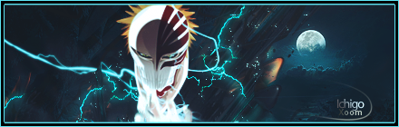
Xoom -
Martin -
Taz -


Vote for the one that you think best follows this week's theme, videogames.
How it looks, and how well it follows the modern conventions of signatures.

Please give critique if possible, and why you voted for who you are voting for.
This is not going to be a popularity contest.

Voting will end on Sunday.


---------- Post added at 09:17 PM ---------- Previous post was at 09:16 PM ----------

I'll post full critique on all signatures after voting has officially ended.
#2
I personally voted for Xoom :D
#3
Guyz, please tell us who you voted for and why. <3
#4
Martin, cause I like the overall look of his signature. :D
#5
Moar votes needed.
#6
Taz wrote:
I personally voted for Xoom :D


Ty =) .
#7
Xoom gmv. Love the colors and effects. Best one in the whole bunch imo. Martin's follows

Too lazy to post critique, so yea.
#8
So...
4th: Xoom. The sig. was pretty good, but the theme was video games, and even though Bleach probably has loads of video games, the franchise started with the manga/anime.
3rd: Taz. Just a bunch of stuff put together, doesn't really blend.
2nd: Minora. No sure were the focus is, the crowbar is really distracting.
1st: Martin. Maybe because I'm a sucker for Legend of Zelda, or maybe because I just liked the sig. The black borders kind of irks me...


P.D.: Eli, mind making the order of the poll and of the thread match?
#9
Drakonid wrote:
So...
4th: Xoom. The sig. was pretty good, but the theme was video games, and even though Bleach probably has loads of video games, the franchise started with the manga/anime.
3rd: Taz. Just a bunch of stuff put together, doesn't really blend.
2nd: Minora. No sure were the focus is, the crowbar is really distracting.
1st: Martin. Maybe because I'm a sucker for Legend of Zelda, or maybe because I just liked the sig. he black borders kind of irks me...


P.D.: Eli, mind making the order of the poll and of the thread match?


Next time.
Work in progress.
Thanks for taking the time to critique them.
#10
I voted for Martin. Everything flows perfectly and the color looks great.
#11
Gabe wrote:
I voted for Martin. Everything flows perfectly and the color looks great.


The flow goes in two directions.
Speaking literally that is.
#12
Eli wrote:
The flow goes in two directions.
Speaking literally that is.


It really doesn't.
And have you seen Xoom's sig?
The left side has flows going all around.
Sorry if I'm not allowed to say that? :x
But I'm strictly not voting for anyone.
#13
Martin wrote:
It really doesn't.
And have you seen Xoom's sig?
The left side has flows going all around.
Sorry if I'm not allowed to say that? :x
But I'm strictly not voting for anyone.


Yes, it does go in two directions.

Xoom's signature has virtually no flow, and I think it looks fine.

However whom I voted for will remain undisclosed.
Voting is over, and I will critique everyone's in a few minutes.

I'll contact saved and we will both send you your prize.
Congratulations Martin.
#14
Eli wrote:
Yes, it does go in two directions.

Xoom's signature has virtually no flow, and I think it looks fine.

However whom I voted for will remain undisclosed.
Voting is over, and I will critique everyone's in a few minutes.

I'll contact saved and we will both send you your prize.
Congratulations Martin.


The smudging was an attempt at flow I'm pretty sure.
Then the tree in the background, goes up, destroying that,. imo.
And I thought voting ended sunday?
But thank you.
#15
Martin wrote:
The smudging was an attempt at flow I'm pretty sure.
Then the tree in the background, goes up, destroying that,. imo.
And I thought voting ended sunday?
But thank you.


It's more or less, a theme signature.
I like it.

And no, voting is going to be ending Saturday from now on.