A preserved archive of the Logical Gamers community forums, 2009-2025. The original threads and posts, served read-only. Registration, posting and private messages are gone for good.
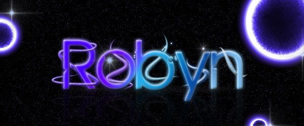
This is my newest graphic. First off tell me what you think. Then tell me what else I should do to it. XD I'm stuck. Even if you hate it, give me an idea, something else to add, or a different effect. I'm trying to do a lighting effect, but I'm having a lot of trouble making it look good. Maybe some help with that or whatever.
The pentooling around the R,O,Y,N looks good but "B" looks like it's just not part of the "B". maybe increase the transparency on the reflection layer to make the reflection pop. maybe throw in a nebula stock in the background to blend with the noise filter in the bacground to give it a more spacey feel. you could also make some clipping masks of a nebula stock with a splatter brush to make the flow more. use dodge/burn on the big glowing stars to add some depth. overall it's cool looking!
Never save as .jpg
It kills quality, and loses any transparency.
Always save as .png
Also, as far as the letters with the swirly things (technical term btw), have more of the swirls going over the letters, otherwise it just looks like it's behind them.
LG Chatlive threads
I've put the forum in archive mode - keeping basic chat here in case people drop by with a message. If anybody is still around happy to talk about building a small new little community, otherwise will just leave it archived.