Some parts look a bit oversharpened(unless it was some effect you were going for. But if you didn't sharpen it, i'm referring to those little light blue things behind her). It's really simple and likable, but doesn't really appeal to me on a white background like the LG skin since you're using a light colored background too(would be good on a darker skin tho). Oh, and I dislike the rounded edges(I don't like them in any tag, honestly. Prolly because it's my personal preference, or that people only use them in sprite tags recently). I like the colors.
Try adding more effects in your next tag, and make it bigger(but not too big).
Hm, that's all xD. My thoughts are all over the place, sorry >.<
^The double focal makes my eyes go in all directions. The text is nice, but the whole thing feels like it lacks something. I can't put my finger on it tho
@Martin
Awesome background, it looks like the sky. The color is also great because it kind of gives that look sepia feel to it. What I like most would probably be the speckles of light which imo looks like dirt(in a goodway), which looks like link is galloping in somewhere. However you could do a lot more with the text, such as putting so it runs down his arm, or using a combination of different fonts. Also the brushes on the right really bother me. I can see a circle brush with its opacity lowered...I suggest you blur it out.
@gotxbrain
I guess you have to know a bit about the whole signature. The double focals on opposite sides bothered me until he lowered the opacity of the guy. I believe the man is the "silent" part, he's needed in the sig but he's not the attention. He'll be what your eyes shift to after seeing the crowbar. I believe the crowbar represents some sort of action that makes him the "protagonist."
@eli
FISHIEEEE o 3o
@ Xoom
; A ; I've never been on a real gfx site before. Maybe I should try now that I'm on the gfx team.
Oh, and I didn't mean to offend anyone. But I'm just pleading, if you post, can you please be at least receptive to the comments.
Anyways, sorry. I'll just post critique from now on.
I think the left side is too much but overall its epic!
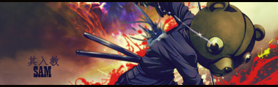
I agree with gotxbrain. Not much flow. And images usually tend to look alot better if you sharpen them. And the splatter brushes are really low quality, in my opinion, some of the best sigs come from using a good smudge brush a nice splatter brush for clipping masks to add flow. A good render that will help with flow. And a light source. I can't tell if its from the bottom left or the right. It should be in the top left if you look at the bears shadows. I tend to use very little c4d's as possible. They start to clutter up and take a lot of focus off your subject. You want to draw your eye to one thing on the image, make it less distracting. The font placement is akward, use the rule of thirds to really enhance the image, font can Make or break an image, as I've learned the best font is the most simple, such as ms sans ir Arial. As the main focus is your render, your font should be noticeable but not take or over power the whole picture. The Japanese stuff makes it look tacky and the gradient on the font does too. Try to use one color from your picture to help it blend to help your main subject. And the border is really large, usually a 2px is the best, or the cinematic border. That's just my opinion. Not saying I don't like it. If you want the best critique on it, start posting your stuff on the planet renders forum. The artists on there are some of the best I've ever seen. And they are brutally honest. They will kill your self esteem but it helps alot. If that makes sense.
great input, care to take a crack at critiquing mine now?
Do you really want me to?
It's a very ammature signature. First thing I see is the car. It has a very distracting green glow to the headlight. The render is of low quality, and it us very distorted, there isint much blending if not any, you have blue and yellow random c4d's that add absolutely no flow. There is no light source, the image is not very "crisp/clean" looking. As I look at the background there is no blending with the car, it looks as if the car was a giant sticker slapped onto a background. The c4d's with the bg does not help as it goes straight to a distracting color Change. And the brushing on the left has no effect whatsoever. The text is very large and tacky, its not well placed and does not blend at all. If you look at the signature altogether your eyes are moving around alot and can't tell what to focus on.
I would give it a 1/10
That's my honest opinion. Not trying to hurt your feelings at all. I love seeing peoples work. I normally don't criticize. Hope I helped.m
I've had weird sigs lately
i am no inspiration atm
But yeh i did some gradients and textures on the render to make it look like that
the original render is black and white



 Idk Very Simple xD




 rking with.


 V2
V2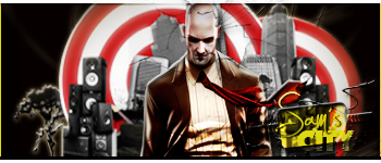
 Critique