A preserved archive of the Logical Gamers community forums, 2009-2025. The original threads and posts, served read-only. Registration, posting and private messages are gone for good.

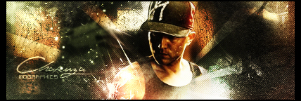
First sig in a while

978 views · started by Martin ·
#1
First sig in a while
Couple months since I made a sig in GIMP.
My old one got annoying, so I asked eli to make me one.
Then I decided to make one.
( Eli's rapes mine :( )

#2
it's terrible. blurred background, lame render, semi-transparant apophysis generated flame- nothing unique about it and poorly put together, colors don't go good together, and the render sticks out like a sore thumb.
#3
Minora wrote:
it's terrible. blurred background, lame render, semi-transparant apophysis generated flame- nothing unique about it and poorly put together, colors don't go good together, and the render sticks out like a sore thumb.


Can I see examples of your sigs so I know you're just not thinking of things an actually know what you're talking about? :)
#4
C4ds should flow with your signature; not just slapped on there.
And the blur is awful, I find when I use the blur tool I lower the opacity quite a lot.
#5
Defy wrote:
C4ds should flow with your signature; not just slapped on there.
And the blur is awful, I find when I use the blur tool I lower the opacity quite a lot.


I did try to position it, but once i saved the .png i realized how stupid the placement of one of them was. ( around his head i think you hate? cause that's what i hate )
I don't understand what's so bad about the blur? :/
#6
Martin wrote:
I did try to position it, but once i saved the .png i realized how stupid the placement of one of them was. ( around his head i think you hate? cause that's what i hate )
I don't understand what's so bad about the blur? :/


An entire signature has to flow. What you did to the background was over blur it, its a stress on the eyes.

Here's a list of what you need to fix.


    Your focal
  • Text
  • C4Ds
  • Background
#7
Defy wrote:
An entire signature has to flow. What you did to the background was over blur it, its a stress on the eyes.

Here's a list of what you need to fix.


    Your focal
  • Text
  • C4Ds
  • Background

Mk, i'll try to keep that in mind while making my next sig. Thanks :)
#8
Gimp fails too, you need to fix that horrible program by getting rid of it. I didn't even notice the text, but yes that needs to be fixed too. it's just randomly slapped on there.

you can go to my profile and find threads i started, or look at my application for graphics team
#9
Martin wrote:
Couple months since I made a sig in GIMP.
My old one got annoying, so I asked eli to make me one.
Then I decided to make one.
( Eli's rapes mine :( )


improve your background bro as far as the c4d its ok
#10
Minora wrote:
Gimp fails too, you need to fix that horrible program by getting rid of it. I didn't even notice the text, but yes that needs to be fixed too. it's just randomly slapped on there.

you can go to my profile and find threads i started, or look at my application for graphics team


Gimp is fine.
#11
imho gimp is terrible, i find it difficult to use and the work that comes out is usually mediocre. If it works for you, however, then you are allowed to use it.
#12
Minora wrote:
imho gimp is terrible, i find it difficult to use and the work that comes out is usually mediocre. If it works for you, however, then you are allowed to use it.


You fail too understand what an opinion is. Because you find it difficult to work with doesn't mean it is in fact a terrible program. And the work that comes out does not make the program it self a terrible program. The user is the cause.
#13
i'd like to reiterate the letters IMHO, which mean in my humble opinion. You are allowed to your opinion, as i am to mine.
#14
Minora wrote:
i'd like to reiterate the letters IMHO, which mean in my humble opinion. You are allowed to your opinion, as i am to mine.


Made in gimp.

And better than anything you've made up to date lol.

(notmine)
#15
The effects look too messy(looks like c4ds in linear dodge and in random places). The focal placing is alright(because you should never put it in the center... EVER) but the flow goes in all directions and makes everything look weird. The blur is also too much and the composition of the tag doesn't really work at all. Actually, I'd like to suggest using renders instead of stocks (because sometimes, good tags are hard to make if the stocks are too detailed) for now, and working on adding effects and creating flow. If you wanna get back at it for good, try reading some GIMP tutorials (I have none cause I don't use it, sorry) and keep on practicing and ask for critique. Maybe you could try working on one specific thing per tag, for example: Flow on one tag, colors on another, and effects on another... and so on, but it's up to you really. I wouldn't recommend borders(old fashioned imo) and text though, but if it's a forum sig, I guess it works :p Just try making your text more visible next time.

So yeah, just keep it up. It's alright for a sig after a few months of inactivity.
LOL, I typed so much, haha. This is what happens when I'm bored, so sorry if you don't get some things I said :p
#16
I went back and searched for the text after reading the comments. Yeah, that's bad haha xD
I'm going to go check out gimp and see how it works too.
I think the colors are alright, it's the effect that doesn't go with the image.