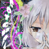
Too messy, text is unreadable, and the low opacity render doesn't work imo. Since you were going for that background, abstract would probably be better.
'gotcha' is hard to read. Remove that and it'll be better.
I'd have to say the biggest flaw in both is that there is too much going on in the background.
Like the other say the text is unreadable. You could either remove it or change the font to another one. Also you can see the backround in the face of the character so I recomand to use a soft brush and erase the backround there. And maybe a border but not necessary.
The stroke on the text made it look pixelated.
But it's better.
Can you send the *.psd to me?
Just put it in a *.rar and upload to megaupload or a site like that.