Another one to Rate
1k views · started by Snow-kun ·
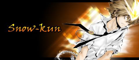
i give it a 9
You're doing good but you need better font choices.
And you should extend the design and such throughout the whole image.
7-8/10
And you should extend the design and such throughout the whole image.
7-8/10
This one is better but you need t rk on the empty space on the left.
Also why does the orange burst seem to stop on a straight line?
rk on the empty space on the left.Also why does the orange burst seem to stop on a straight line?
I give it a 5. The render doesn't blend at all and the sig is so boring. There's only color in that one spot.
I smell *improvement* It's better than the last one, still I would have wanted to see a better background, it's just to simple with a black, empty space behind.
Render seems hastily cut out. This could be done in ~2 minutes. Background layer, black to orange gradient with a thick stroke, then text with a few effects, a smugded object of some sort, and then the render, with little if any attempt to blend.
Try bringing stuff OVER the render, maybe?
Try bringing stuff OVER the render, maybe?
Font doesn't match. You need to learn how to blend & how to use renders(not cutting out the image. But the digitalized stock art) to make the effects more tantalizing to the eyes.
Sorry for busting your bubble babe <3
4/10
Sorry for busting your bubble babe <3
4/10
I agree with Hara. The cut out isn't great, I also feel like the text is just awkward and too simple with just a outer stroke. There's a lot of empty space on the left, it's kind dull. 4/10
It's kind of boring. 6/10
very nice 8/10.your improving aren't ya? 