A preserved archive of the Logical Gamers community forums, 2009-2025. The original threads and posts, served read-only. Registration, posting and private messages are gone for good.

New Project Logo

1.3k views · started by Cyanoxide ·
#1
New Project Logo
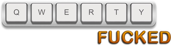
Over this week I am going to be working on a projected called QwertyFUCKED! It's basicly and essentially going to be a blog that I'm going to code myself just for good practice, I'm going to use it to talk about the twatish things me and my friends get up to at college.

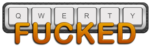
Generally when I start working on a site the first thing I design is the logo and in my opinion I think I'm getting rusty with Photoshop because of extensive Dreamweavering so I posted the logo I designed onto here so you can rate it and criticise its flaws and all that other stuff that happens, so yeah you get the idea so here it is:

#2
It is wonderful! The black border is kinda awkward. But if the background of the site will be dark then It will look fine.
#3
I agree that the border looks wierd. I think that you should make the text bigger and find some other way to display "fucked". The way that the top half of the word overlaps with the keys looks kind of bad, and could be worse depending on the background the logo is on.

The word itself is well done though, as are the keys. Nice job. :)
#4
It's actually quite nice. The only thing I don't really like is the border on the outside of the keys. The blackish boarder.
#5
I took into consideration everyone's comments and made a few different ones.


it was a rush so some of the sizes are off and the backgrounds may not be transparent.
#6
The second one is the best. But could you make the word "Fucked" start on the "r" or "e" key? Wanna see how that looks real quick.
#7


Like that?
#8
Cyanoxide wrote:


Like that?


Lol, I was talking about moving the work "Fucked" to the right under the letter r.
#9
Very funny, sir.

I think that the Fucked part actually looks better with bigger text.
#10
I lol'd, I was wondering why I was changing it to an E or R :P

#11
Cyanoxide wrote:
I lol'd, I was wondering why I was changing it to an E or R :P


That is amazing! In my opinion that is perfect!
#12
Fair enough, If anyone has more suggestions you'll have to show me yourself as I have deleted the psd. I will probably post a small tutorial on how to get that text effect as well.
#13
Put the start of "Fucked" exactly under the R and make it a larger key.

Making it look like a real keyboard, see?
#14
I like the last version the best.