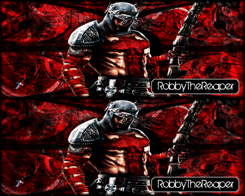
First sig since I re-downloaded photoshop. Only like my fifth ever, so rating pl0x.
(Probably gonna reduce the height a little) It isn't done yet, but this is basically what it's gonna be. If you have any recomendations let me know, such as what text to use and junk.
Changed a littleeee
Decided to just use the wheels for patterns, can't even tell their wheels now.
Also decided on this as my avatar.
Sorry there's not much flare to it =O I like to keep my junk simple.
Results 1 to 21 of 21
Thread: Rating so farrr
- 21 Jan. 2010 12:36am #1Reply-Inducing


- Age
- 30
- Join Date
- Jan. 2010
- Location
- Atlanta, GA
- Posts
- 1,708
- Reputation
- 64
- LCash
- 200.00
 Rating so farrr
 Last edited by Enjoi; 22 Jan. 2010 at 12:27am.
- 21 Jan. 2010 11:01am #2

The wheels bug me. They seem low quality, and the edges are weird.

Disco is neat.
- 21 Jan. 2010 08:09pm #3Reply-Inducing


- Age
- 30
- Join Date
- Jan. 2010
- Location
- Atlanta, GA
- Posts
- 1,708
- Reputation
- 64
- LCash
- 100.00

I rendered em' straight from the site >> And what do you mean by the edges?
- 21 Jan. 2010 08:40pm #4

The edges of each wheel. They look like they were cut out.

Disco is neat.
- 21 Jan. 2010 08:51pm #5Reply-Inducing


- Age
- 30
- Join Date
- Jan. 2010
- Location
- Atlanta, GA
- Posts
- 1,708
- Reputation
- 64
- LCash
- 100.00

They're off of here >>
NHS Fun Factory: Ricta Wheels: Wheels: 52mm All Star Crystal Chrome
- 22 Jan. 2010 12:14am #6MotM-August '10

Error: Title Not Found
- Age
- 29
- Join Date
- Dec. 2009
- Location
- Hell
- Posts
- 2,248
- Reputation
- 248
- LCash
- 100.00

The wheels look fine aside from the 1px white line running along each one's edges.
The panda... it's all wobbly on the edges ;o
- 22 Jan. 2010 12:21am #7Reply-Inducing


- Age
- 30
- Join Date
- Jan. 2010
- Location
- Atlanta, GA
- Posts
- 1,708
- Reputation
- 64
- LCash
- 100.00

I know that, it's supposed to be like that xD But I did change it, just need to know which you guys like best.
- 22 Jan. 2010 12:28am #8MotM-August '10

Error: Title Not Found
- Age
- 29
- Join Date
- Dec. 2009
- Location
- Hell
- Posts
- 2,248
- Reputation
- 248
- LCash
- 100.00


Should make it a white background ;o
Or make it look like a sticker by making a selection around one of the rendered pandas, then extending it by 10 pixels or so, then making a new layer to paint a white -but slightly yellowish- background on it.
I'll make one for example.
- 22 Jan. 2010 12:29am #9Reply-Inducing


- Age
- 30
- Join Date
- Jan. 2010
- Location
- Atlanta, GA
- Posts
- 1,708
- Reputation
- 64
- LCash
- 100.00

oooooo I see what you're saying xD I might make like a deck with one of those on it, tomorrow.
Last edited by Enjoi; 22 Jan. 2010 at 12:50am.
- 22 Jan. 2010 01:00am #10MotM-August '10

Error: Title Not Found
- Age
- 29
- Join Date
- Dec. 2009
- Location
- Hell
- Posts
- 2,248
- Reputation
- 248
- LCash
- 100.00


- 22 Jan. 2010 01:02am #11Reply-Inducing


- Age
- 30
- Join Date
- Jan. 2010
- Location
- Atlanta, GA
- Posts
- 1,708
- Reputation
- 64
- LCash
- 100.00

Lol, nice. But I'm probably gonna use a picture of my deck so it looks extra grimy.
- 22 Jan. 2010 01:06am #12MotM-August '10

Error: Title Not Found
- Age
- 29
- Join Date
- Dec. 2009
- Location
- Hell
- Posts
- 2,248
- Reputation
- 248
- LCash
- 100.00

lawl grimy .
You could always get an image of a deck, render it (decks are easy to render) and add a simple overlay image of a grunge/wood texture to add some scratches to the deck.
- 22 Jan. 2010 01:09am #13Reply-Inducing


- Age
- 30
- Join Date
- Jan. 2010
- Location
- Atlanta, GA
- Posts
- 1,708
- Reputation
- 64
- LCash
- 100.00

How would I do that? o-o This is probably the one I would use though, it's my current one.
 I'd also need a way to make the tail/nose seem worn.
- 22 Jan. 2010 01:21am #14MotM-August '10

Error: Title Not Found
- Age
- 29
- Join Date
- Dec. 2009
- Location
- Hell
- Posts
- 2,248
- Reputation
- 248
- LCash
- 100.00


+

=

- 22 Jan. 2010 01:25am #15Reply-Inducing


- Age
- 30
- Join Date
- Jan. 2010
- Location
- Atlanta, GA
- Posts
- 1,708
- Reputation
- 64
- LCash
- 100.00

That's pretty sick, I'll work on one tomorrow, just got kicked off the only good computer I have.
Logical gamers? More like get high and start pushing buttons god damn.
- 22 Jan. 2010 01:28am #16MotM-August '10

Error: Title Not Found
- Age
- 29
- Join Date
- Dec. 2009
- Location
- Hell
- Posts
- 2,248
- Reputation
- 248
- LCash
- 100.00

If you want to try, put the deck, and the grunge image on two seperate layers (grunge on top). Render the board, then right click the grunge image layer, then apply a clipping mask. Change the blending mode (pulldown box that should say "normal") and set it to lighter color. Adjust the opacity to fit well.
- 25 Jan. 2010 09:25am #17


You should of made it black and white and two pandas fucking.
- 25 Jan. 2010 10:24pm #18Reply-Inducing


- Age
- 30
- Join Date
- Jan. 2010
- Location
- Atlanta, GA
- Posts
- 1,708
- Reputation
- 64
- LCash
- 100.00

I already had that, it's actually what I used to get the panda xD (most of the images I found were on t shirts and junk). I also realized that I could render it piece by piece (the black parts) and just flatten it when I'm done to have the render without the white center. Too bad I'm still high so there's no way I'd be able to actually do it.
Last edited by Enjoi; 25 Jan. 2010 at 10:27pm.
Logical gamers? More like get high and start pushing buttons god damn.
- 30 Jan. 2010 11:42pm #19

- 03 Feb. 2010 08:18am #20Reply-Inducing


- Age
- 30
- Join Date
- Jan. 2010
- Location
- Atlanta, GA
- Posts
- 1,708
- Reputation
- 64
- LCash
- 100.00
- 06 Feb. 2010 05:30pm #21

just sharpen it up a bit. trry. duplicating your starting layer. change the blend option to overlay or soft light. (if your using photoshop, take the duplicate layer and go filters>other>high pass and play with those settings) when your finished just lower or keep the opacity to make it work.. just a quick way to make stuff more clear and visible.


 LinkBack URL
 About LinkBacks


 Reply With Quote

 also the lighter looks sick to
