Results 1 to 20 of 20
Thread: What do you think?
- 10 Jan. 2010 09:43am #1
 What do you think?
- 10 Jan. 2010 01:58pm #2

Too plain, but nice. (:
Actually, you should make the text a little bit bigger.
- 10 Jan. 2010 04:17pm #3MotM-August '10

Error: Title Not Found
- Age
- 29
- Join Date
- Dec. 2009
- Location
- Hell
- Posts
- 2,248
- Reputation
- 248
- LCash
- 100.00

I think it's kickass. But maybe the little "Logicalgamers" things should extend out more beyond the Mx250z part. Nonetheless it looks great.
- 10 Jan. 2010 06:50pm #4

Yea theres alot that can be done to make it better. i made as simple as possible lol
just threw some text in the bg rotated it. put some bigger text on top. put the mode on soft light . and threw a black to white radial gradient.
- 10 Jan. 2010 07:38pm #5MotM-August '10

Error: Title Not Found
- Age
- 29
- Join Date
- Dec. 2009
- Location
- Hell
- Posts
- 2,248
- Reputation
- 248
- LCash
- 100.00

You should make the radial gradient larger.
- 10 Jan. 2010 08:51pm #6

Yea lol.. i just wanted a quick bg for my phone.
- 10 Jan. 2010 10:24pm #7
 Oh, snap.
That's pretty spiffy.
I wish I had some skills like that.O HAY.
- 11 Jan. 2010 12:21am #8MotM-August '10

Error: Title Not Found
- Age
- 29
- Join Date
- Dec. 2009
- Location
- Hell
- Posts
- 2,248
- Reputation
- 248
- LCash
- 100.00

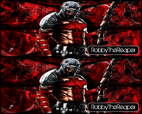
I copied you. This one's for my Halo PC clan ;o

- 11 Jan. 2010 01:58am #9
- 11 Jan. 2010 02:00am #10MotM-August '10

Error: Title Not Found
- Age
- 29
- Join Date
- Dec. 2009
- Location
- Hell
- Posts
- 2,248
- Reputation
- 248
- LCash
- 100.00

You can just copy and paste a bunch of capitalized LOGICALGAMERS text across the page.
- 11 Jan. 2010 02:03am #11
- 11 Jan. 2010 02:15am #12MotM-August '10

Error: Title Not Found
- Age
- 29
- Join Date
- Dec. 2009
- Location
- Hell
- Posts
- 2,248
- Reputation
- 248
- LCash
- 100.00

How bout this attachment. A .PAT file. It's a pattern file so you could load it into your patterns, then you could just use the fill tool on a layer.
- 11 Jan. 2010 08:29am #13

that's pretty sick
would love to see a tutorial for it
- 11 Jan. 2010 10:24am #14
- 11 Jan. 2010 12:51pm #15

it may be easy but some might not know how to do it or might make a mistakes on it messing it up
i'm simply trying to get better at making visuals. Some people on here probably want to get better at it and would like to know how its done. I haven't done photoshop in awhile so i'm relearning everything.
Tutorials no matter how easy or hard is still helpful
if you don't like the fact that i simply asked for a tutorial so i know how to do it correctly and not make mistakes then thats your problem
anyways back on subject
this looks good
also TEMPTii yours is neat to
- 12 Jan. 2010 12:42am #16MotM-August '10

Error: Title Not Found
- Age
- 29
- Join Date
- Dec. 2009
- Location
- Hell
- Posts
- 2,248
- Reputation
- 248
- LCash
- 100.00
- 12 Jan. 2010 01:54am #17

It is a little plain, I like the text, I like the matrix look.

- 12 Jan. 2010 05:22pm #18

i can write up a more thorough tutorial if you all want me too.
- 12 Jan. 2010 05:29pm #19

The full tutorial can be followed here guys:
Reader Tutorial: Typography Wallpaper in Photoshop | Abduzeedo | Graphic Design Inspiration and Photoshop Tutorials
- 12 Jan. 2010 05:46pm #20

Yup thats pretty much it. he just threw in some vectors and overlayed them. very simple stuff guys!


 LinkBack URL
 About LinkBacks

 Reply With Quote


