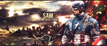
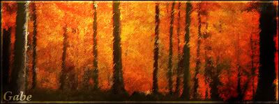
Edit: Dammit keeps resizing.
Edit Edit: There we go...
Variations on technique:
Instead of using Black, use white, or other colors even.
Try different patterns. For a diagonal line fill, make a 3x3 document, fill in pixel in top right, center, bottom left.
Experiment with other patterns as well, with varying degrees of rotation or even random patterns
Results 1 to 6 of 6
Thread: That Cool Line Effect [Tutorial]
- 02 Feb. 2011 12:37pm #1
 That Cool Line Effect [Tutorial]
 Last edited by gotxbrain; 12 Feb. 2011 at 07:54pm.
- 02 Feb. 2011 02:29pm #2

Not The Best Not The Worst But Looks Good
Now All I Need To Do Is Make My Own
I Don't Bite!
- 02 Feb. 2011 02:57pm #3

You should include something about how different basic designs of that original pattern can be used to get different results. For example, using a diagonal line pattern.
- 02 Feb. 2011 03:03pm #4

Oh you can also change the layer blend mode to make the lines lighter or darker. Otherwise very good tutorial. I was going to put up a tutorial like this, but I'll expand on his later.

posting nonsensical crap everyday.
- 03 Feb. 2011 03:40am #5
- 03 Feb. 2011 07:26pm #6

You can also do this in the opposite direction, crosshatch them, make scan-lines etc.
Good job minora.


 LinkBack URL
 About LinkBacks

 Reply With Quote

