This thread needs more posts.
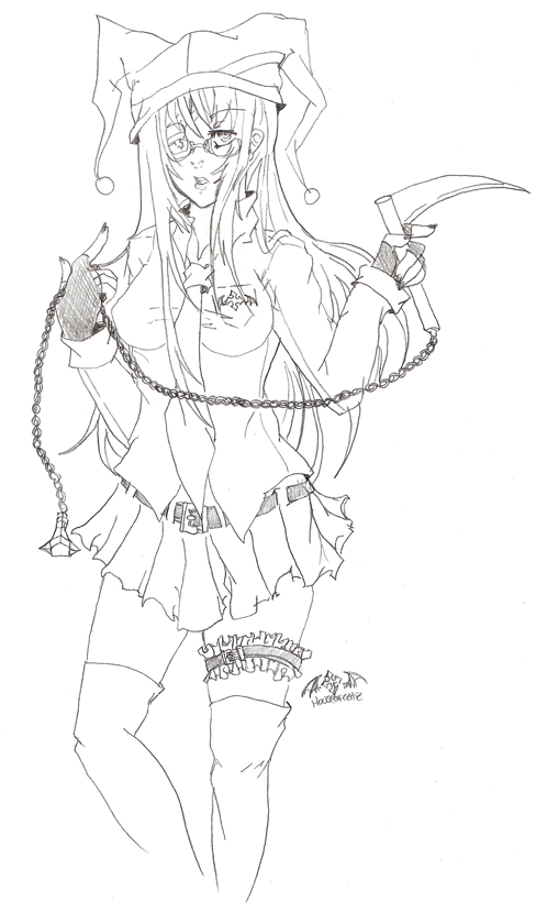
My character zombie, no she's not a zombie and there is no real reason for her name except I like it.
Lol anyways first traditional art I've done in a long while.
Results 1 to 19 of 19
Thread: My character zombie
- 14 Nov. 2010 10:46pm #1Moderator Epic

- Join Date
- Dec. 2009
- Location
- Ontop of a box
- Posts
- 5,090
- Reputation
- 480
- LCash
- 76.00
- Awards


 My character zombie
All hail kitty pig.

- 14 Nov. 2010 10:47pm #2

why are you so good at drawing?
yup this is really me gamersoul AVA
- 14 Nov. 2010 11:33pm #3Moderator Epic

- Join Date
- Dec. 2009
- Location
- Ontop of a box
- Posts
- 5,090
- Reputation
- 480
- LCash
- 36.40
- Awards


Every time I level up I put most my skill points in drawing. j/k
Lots of practice. Like drawing figures and taking 45 seconds on each figure to get the basic idea of anatomy down, drawing people when I'm out to eat on napkins, practice? XD Things like that.
Still have a long way to go, but I'm glad I'm improving.
All hail kitty pig.

- 14 Nov. 2010 11:41pm #4yup this is really me gamersoul AVA
- 15 Nov. 2010 12:29am #5

 how much would you charge for art?
- 15 Nov. 2010 03:17am #6Moderator Epic

- Join Date
- Dec. 2009
- Location
- Ontop of a box
- Posts
- 5,090
- Reputation
- 480
- LCash
- 7.70
- Awards


- 15 Nov. 2010 03:26am #7Global Moderator LG Veteran

- Age
- 34
- Join Date
- Mar. 2007
- Location
- Death Star
- Posts
- 6,693
- Reputation
- 757
- LCash
- 7.00
- Awards


LG Gold for drawing?
Voted Hottest Male Member
Crowned King of Logical Gamers
18 Years of Logical Service.
- 15 Nov. 2010 03:31am #8Moderator Epic

- Join Date
- Dec. 2009
- Location
- Ontop of a box
- Posts
- 5,090
- Reputation
- 480
- LCash
- 8.80
- Awards


- 15 Nov. 2010 03:45am #9Global Moderator LG Veteran

- Age
- 34
- Join Date
- Mar. 2007
- Location
- Death Star
- Posts
- 6,693
- Reputation
- 757
- LCash
- 6.00
- Awards


Eh. Still.
Voted Hottest Male Member
Crowned King of Logical Gamers
18 Years of Logical Service.
- 15 Nov. 2010 10:02am #10

Your drawings are really good...

Charge lg for em
E1 though u dnt use em
- 16 Nov. 2010 03:03am #11

How much for gaia gold?
- 16 Nov. 2010 03:04am #12
- 16 Nov. 2010 03:06am #13Moderator Epic

- Join Date
- Dec. 2009
- Location
- Ontop of a box
- Posts
- 5,090
- Reputation
- 480
- LCash
- 5.45
- Awards


- 16 Nov. 2010 04:46pm #14Notably Active


- Join Date
- Nov. 2010
- Location
- In a dream called Life.
- Posts
- 153
- Reputation
- 7
- LCash
- 26.03

I can imagine this being used as lineart; it's very usable indeed!
Mainly because you didn't include shadows, and that's good, as they're a real bitch to draw.
If you decide to include them in your drawings, always make sure you have a reference point (=like a sun).
Seriously though, if you'd colour this digitally, this could very well look like a professional piece of art.
Now it's looking amazing -I sure agree!- but I figured I still have to give you some critique to make you progress a bit;
I mean, apart from motivating them, telling artists their art is awesome doesn't quite help.
So here's my go at it:
First off, make sure you align the belt well when drawing it through strips of fabric (the pieces that hold the beld).
The lines are slightly off, which looks a bit unfinished...
Your wrinkles are quite arighty as they are, but they still require some practice;
I'm sure it won't take you too long to perfect them - just watch it.
Haven't got any advice regarding them though... I don't know; some perfectionists use real fabric to copy,
others use photographs of poses with a similar cloth, ... But anything is fine; just needs a bit of time to perfect ;]
Just a tiny thing here: make sure the chains are hanging 'straight'. Like... how should I put this... Try looking
at a real chain: gravity pulls the centre down; in your drawing, it's like it's a bit floating around, not quite affected by any forces at all.
This being one of the hardest and tiniest details though! Just mess around with it sometime :]
Lastly -and the only thing that's really bothering me- is the face. Somehow, it feels disproportionated... kind of distorted.
It may be her left eye or the way you've drawn the mouth, but something's kinda off... This is the hardest thing for me to explain;
I wish I could tell you, but truth to be said, I can't. I don't know, maybe using certain guidelines might help?
All in all, as many said before me, this is awesome and we all envy you for your skills! :]
So just take these tips in whatever way you like 'n see whether any of 'em will be useful.
G'luck with your art! ;]
"The only good is knowledge and the only evil is ignorance."
-Socrates
- 19 Nov. 2010 08:24pm #15

her left arm looks a little... oddly bent? it looks kind of flat, or... i dunno.
just bothers me, the wrist facing this direction. I mean i can kind of make my arm do that but it's just such an unnatural pose. :/
other than that, i can't really say anything that hasn't been said already. it's really good!
- 19 Nov. 2010 11:03pm #16Moderator Epic

- Join Date
- Dec. 2009
- Location
- Ontop of a box
- Posts
- 5,090
- Reputation
- 480
- LCash
- 9.18
- Awards


@The_Theomorphic_Librarian: Thank you for the feed back! I can definitely see where you're coming from on all points. Also I think her head may be too big for the rest of her. XD Thanks again for the great critique!
@Minora: Oh? I can do that pose just fine with out being uncomfortable, unnatural you say? I'll have to keep that in mind for next time. o3o-; Also her left or our left? Sorry I just like to clarify. XD
All hail kitty pig.

- 20 Nov. 2010 12:08am #17

her left, the one holding the scythe thingy. It seems to me like it should be natural, but it isn't. Like, her arm is perfectly straight, and it looks like her wrist should be a straight line from her shoulder, which is what is making the pose unnatural. do you get what i'm saying?
- 20 Nov. 2010 01:13am #18Moderator Epic

- Join Date
- Dec. 2009
- Location
- Ontop of a box
- Posts
- 5,090
- Reputation
- 480
- LCash
- 5.77
- Awards


- 28 Nov. 2010 02:53am #19

is it me or does the chains look funny, other then that it looks like something i would get a tatoo of..


 LinkBack URL
 About LinkBacks


 Reply With Quote


