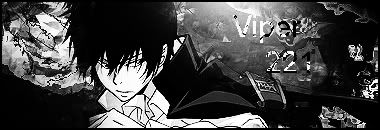
It's nice, except for the text. It's hardly seeable and it just looks weird. Plus, everything seems so....sharp to me.
It's pretty good except for the text and it's a bit oversharpened. (As mentioned above)
For the text, don't think too much about it.
Use a plain white text and make it small near the light source.
7/10
It's a little plain, but with some good effects. I'm not fond of the text though, it's hard to read and blends too much. 7/10
I like the right side, except the text doesn't fit. But to the left side of the character it just seems a bit of a mess.
Maybe try using a smaller and different font in the bottom left, where it's all black. Use a white font and it will stand out really well obviously. I think a splash of colour through the piece would look good too. Like a sky blue.
Nice. What did you make this with Photoshop?